


clothbound greyboard with die-cut and matte foil / 128-192 pages
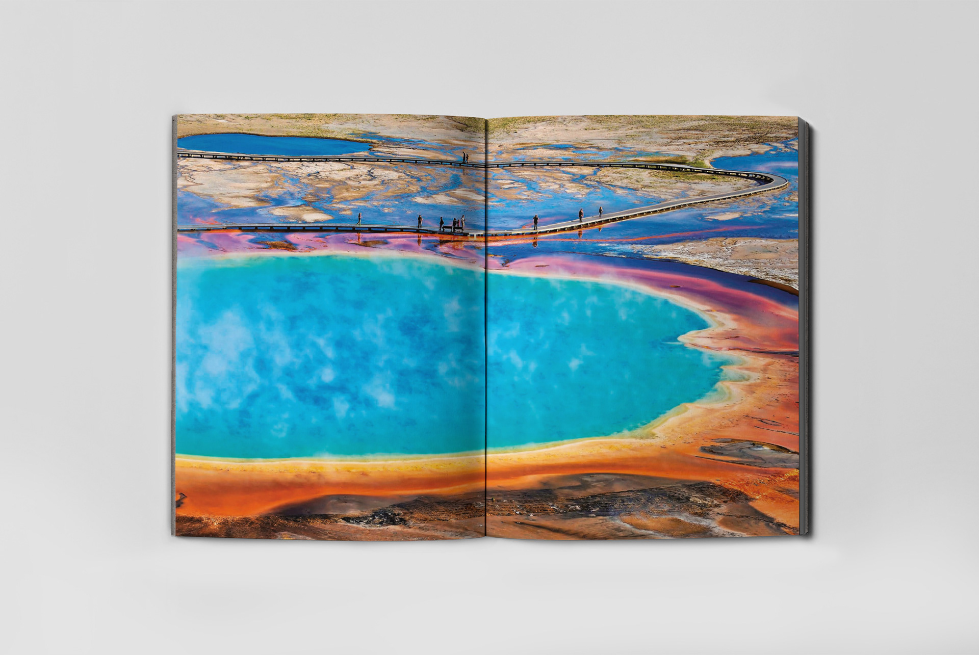
Lonely Planet are known for their stunning photographic imagery. In a market flooded with illustrated, pared back stationery, the task was to create a stationery range that could compete but also remain on brand.
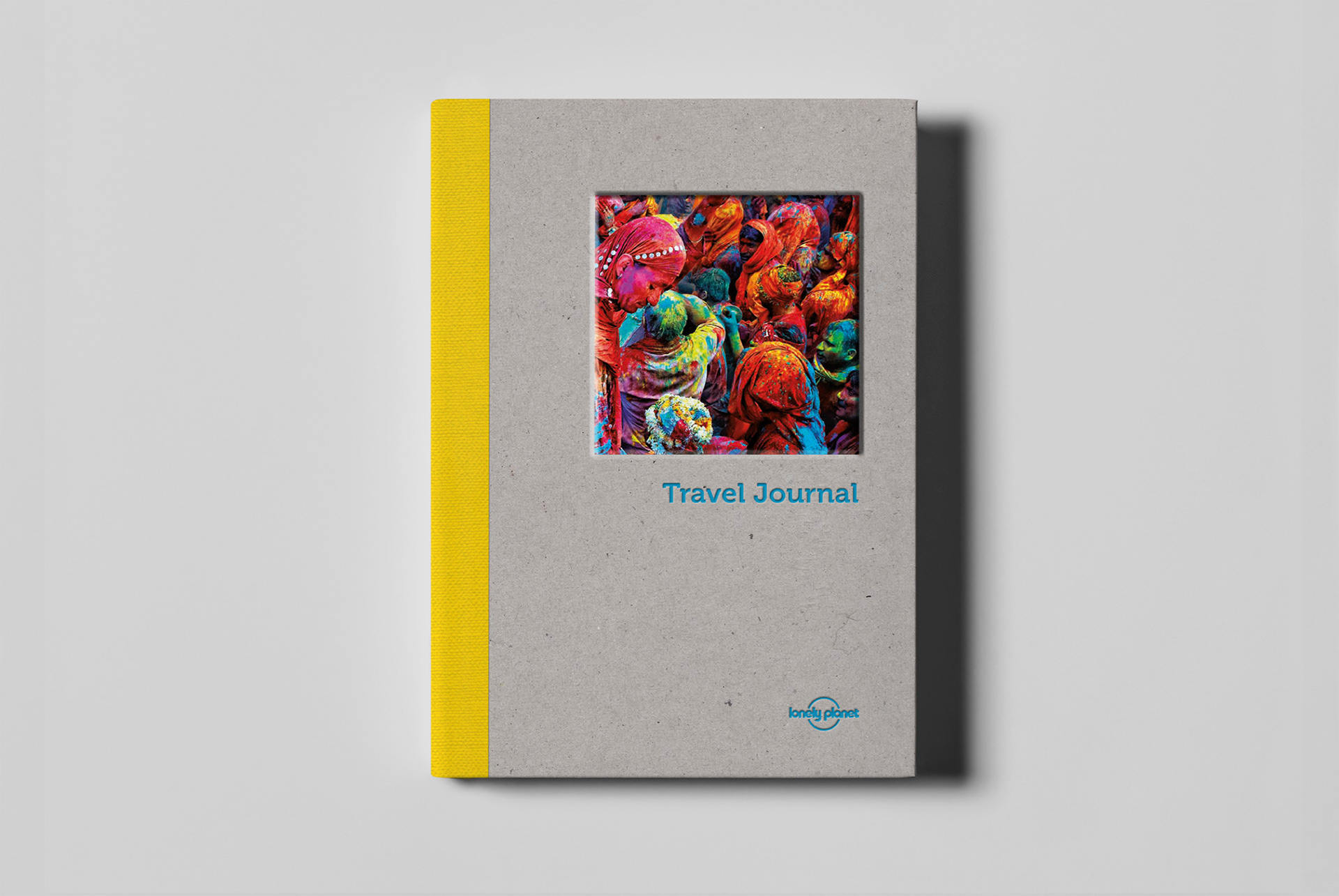
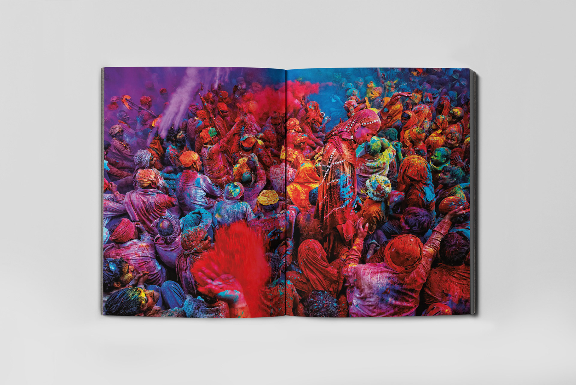
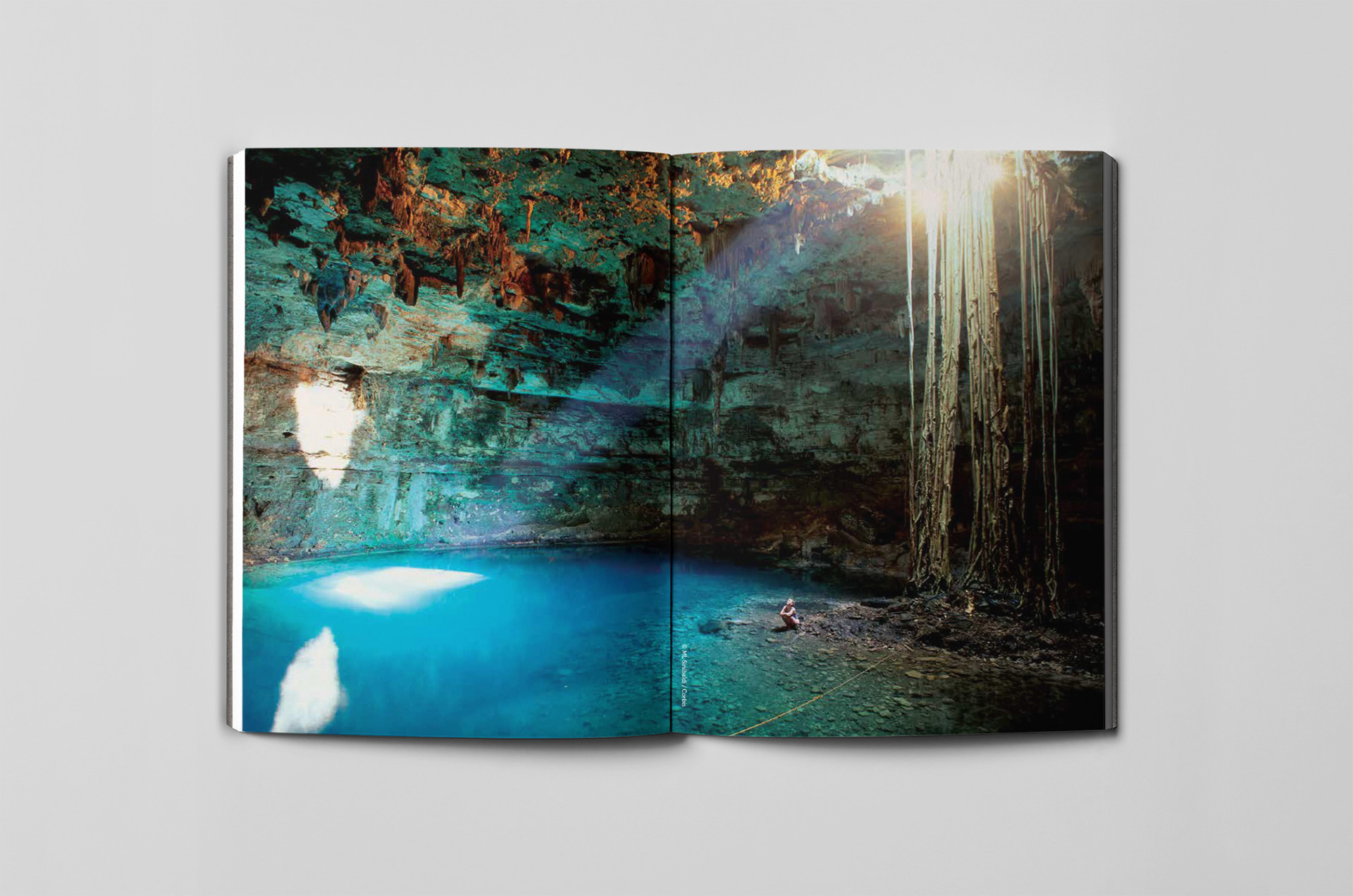
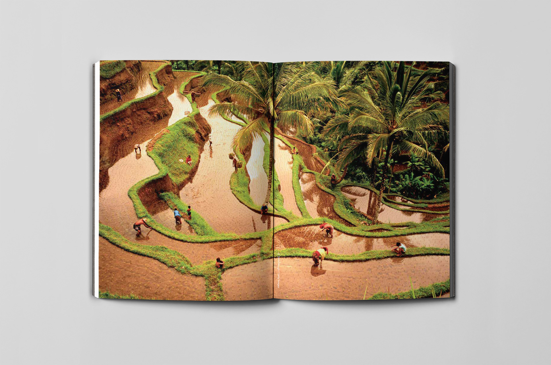
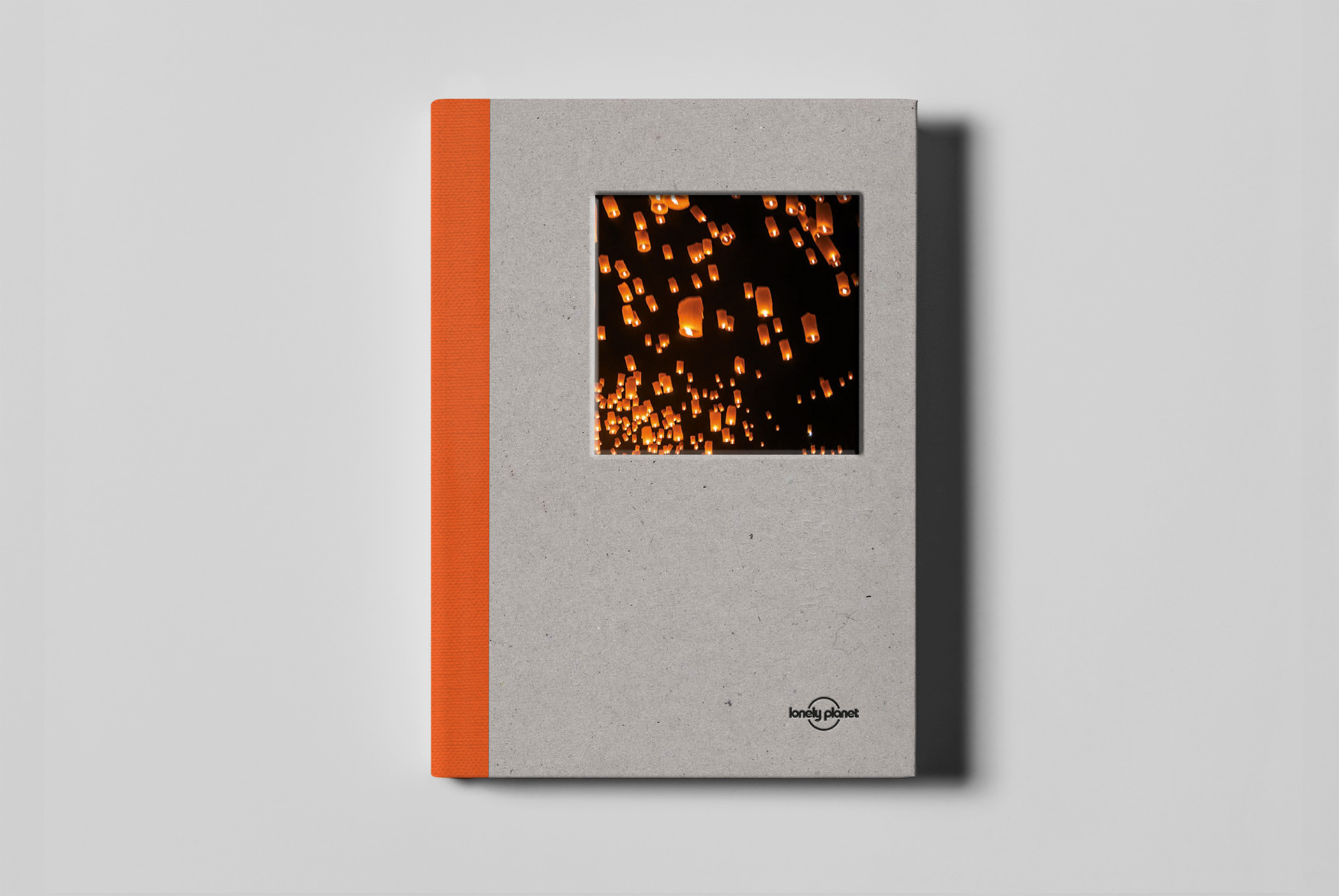
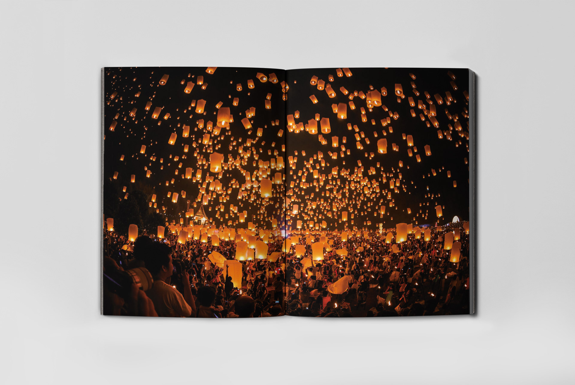
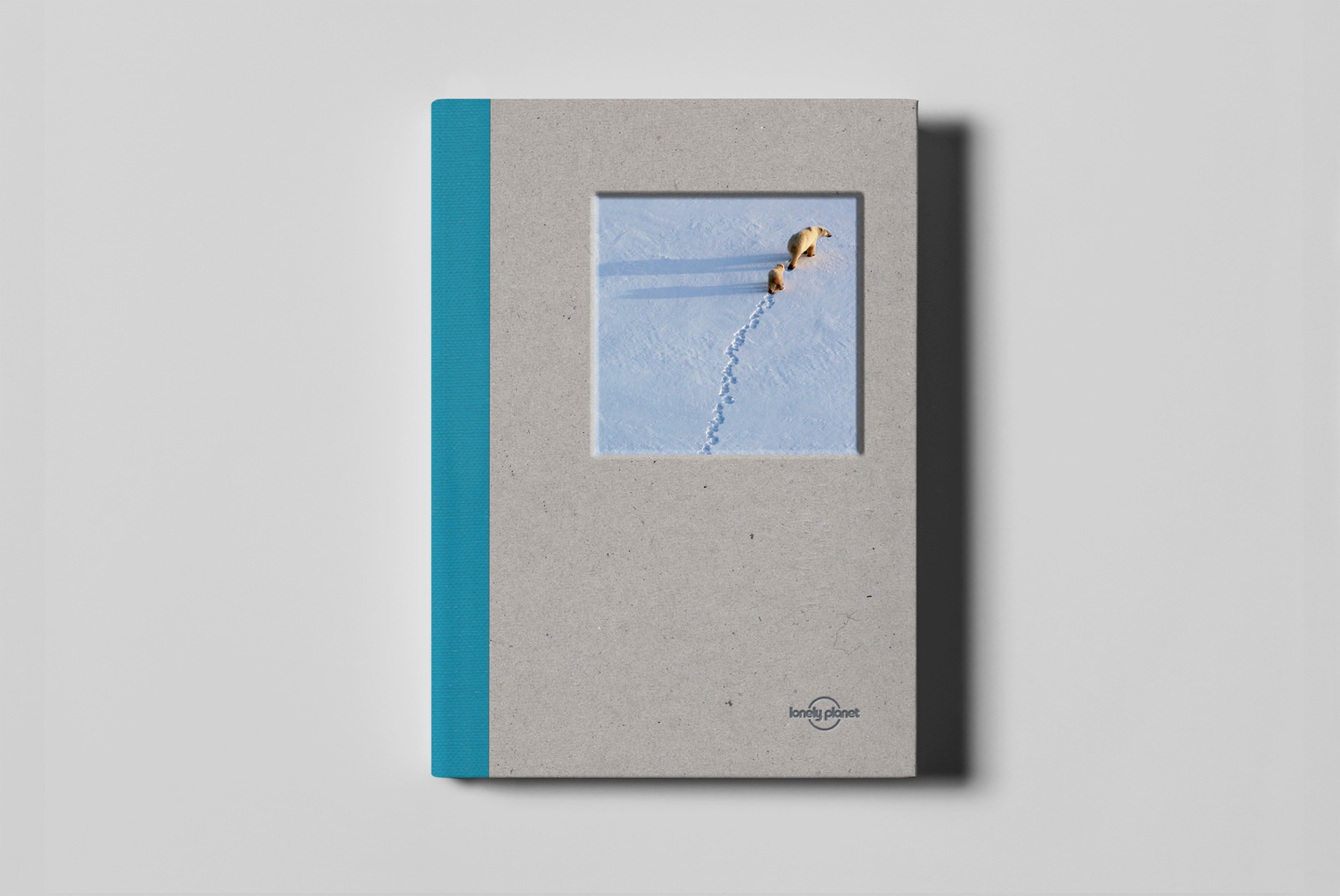
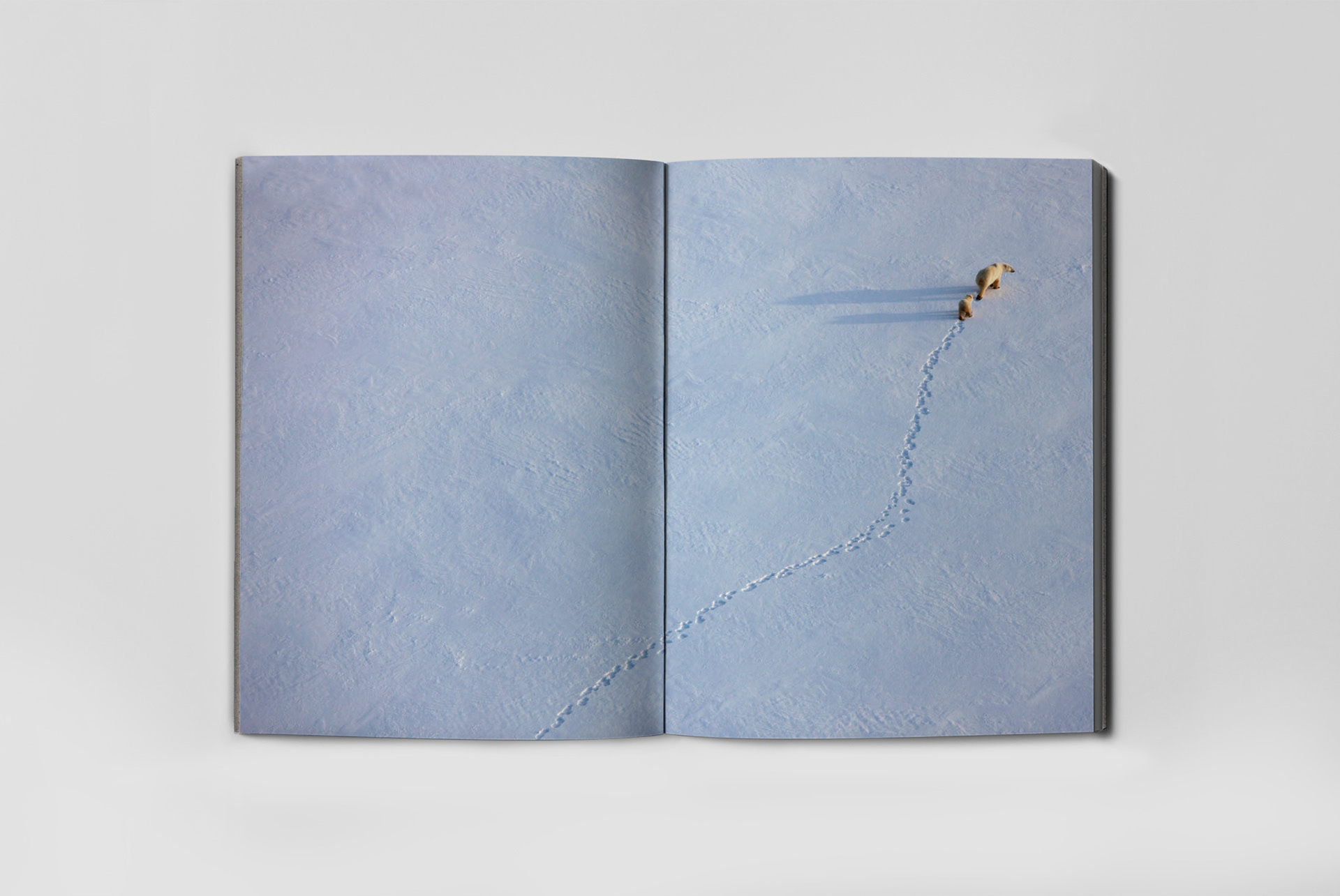
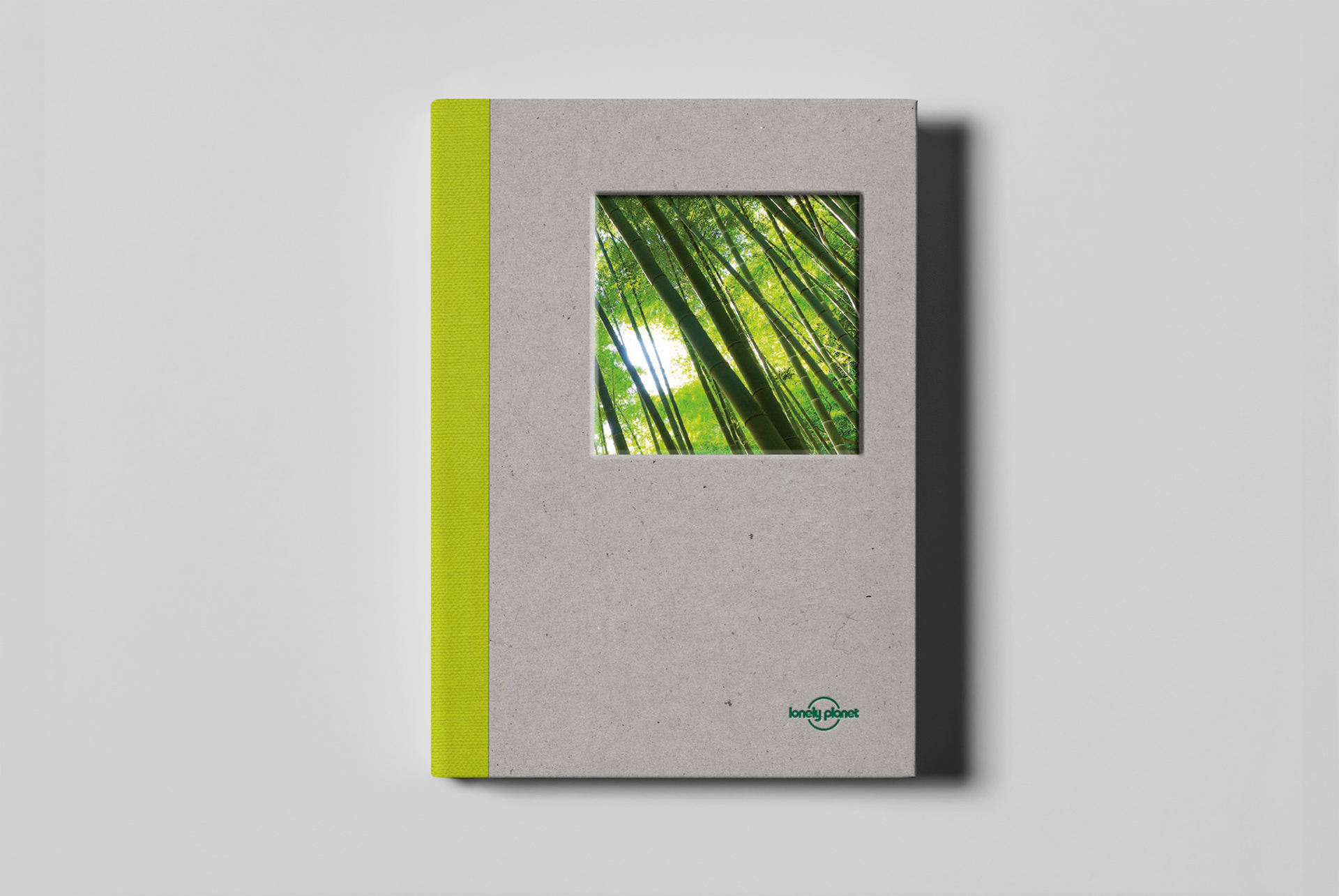
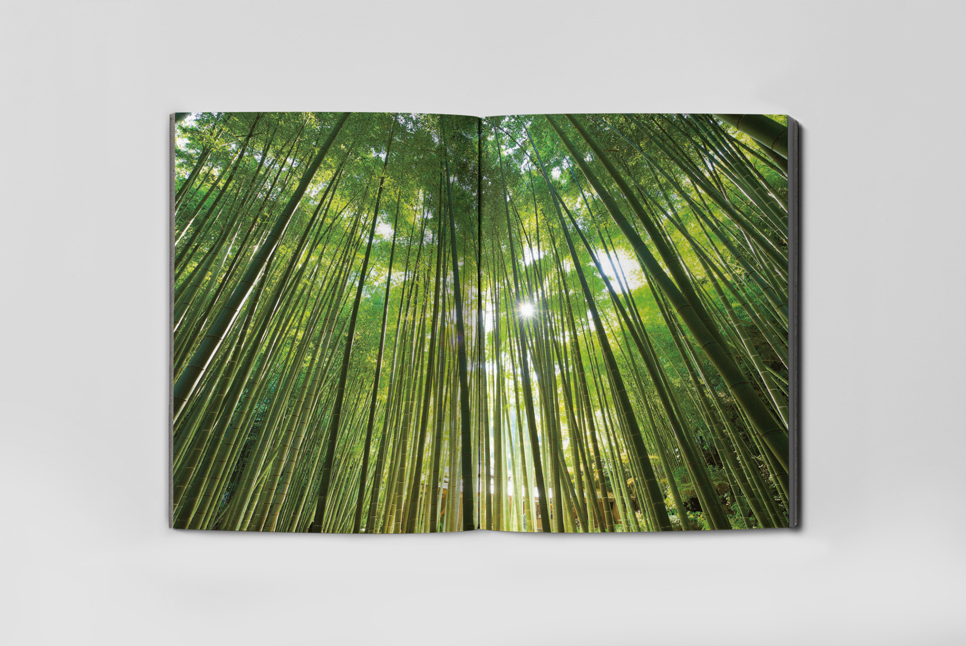
In terms of the design direction, I wanted to give people something intriguing to bring them over to the Lonely Planet stationery range in a shop or click on it online, something tactile to make them pick it up and notice it was a bit different to the masses, then give them a surprise when they opened the product. The surprise being that they could see a photo on the cover but when they opened the cover, they’d be floored by an absolute corker of an image! I felt with that build up and interaction, it’d be hard to put the product down, so if we got the content right too, we’d make the sale!
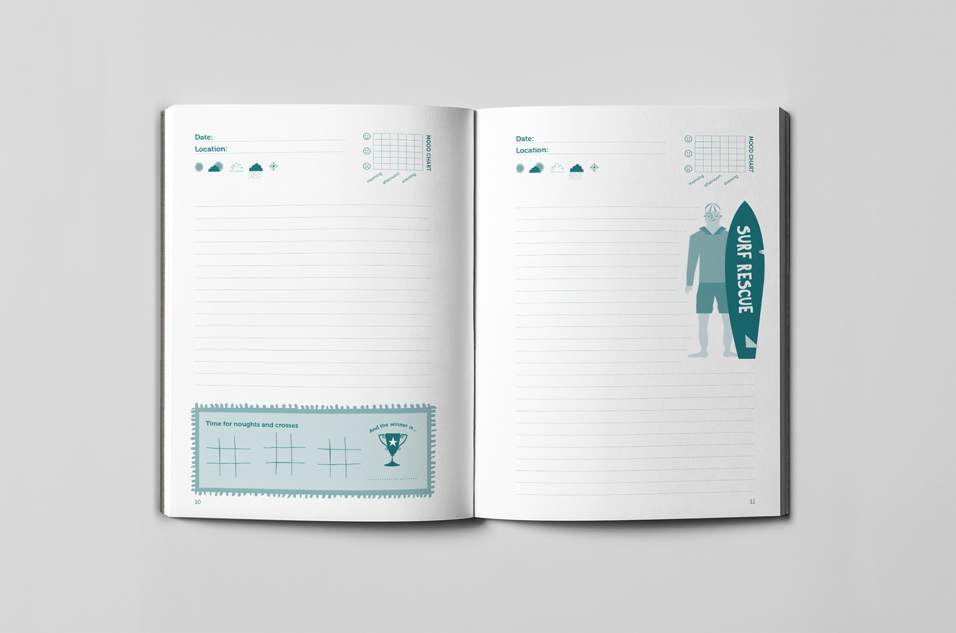
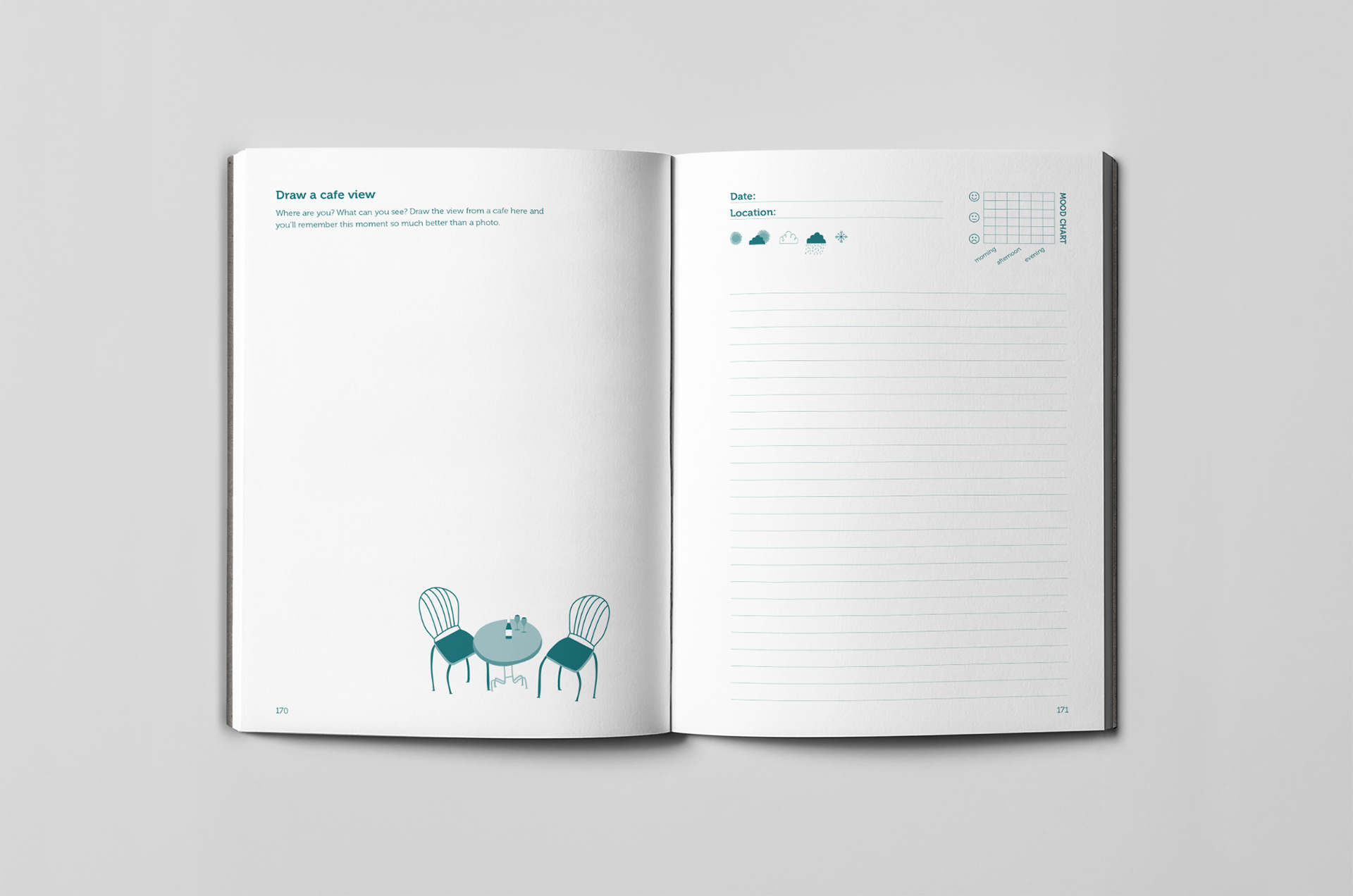
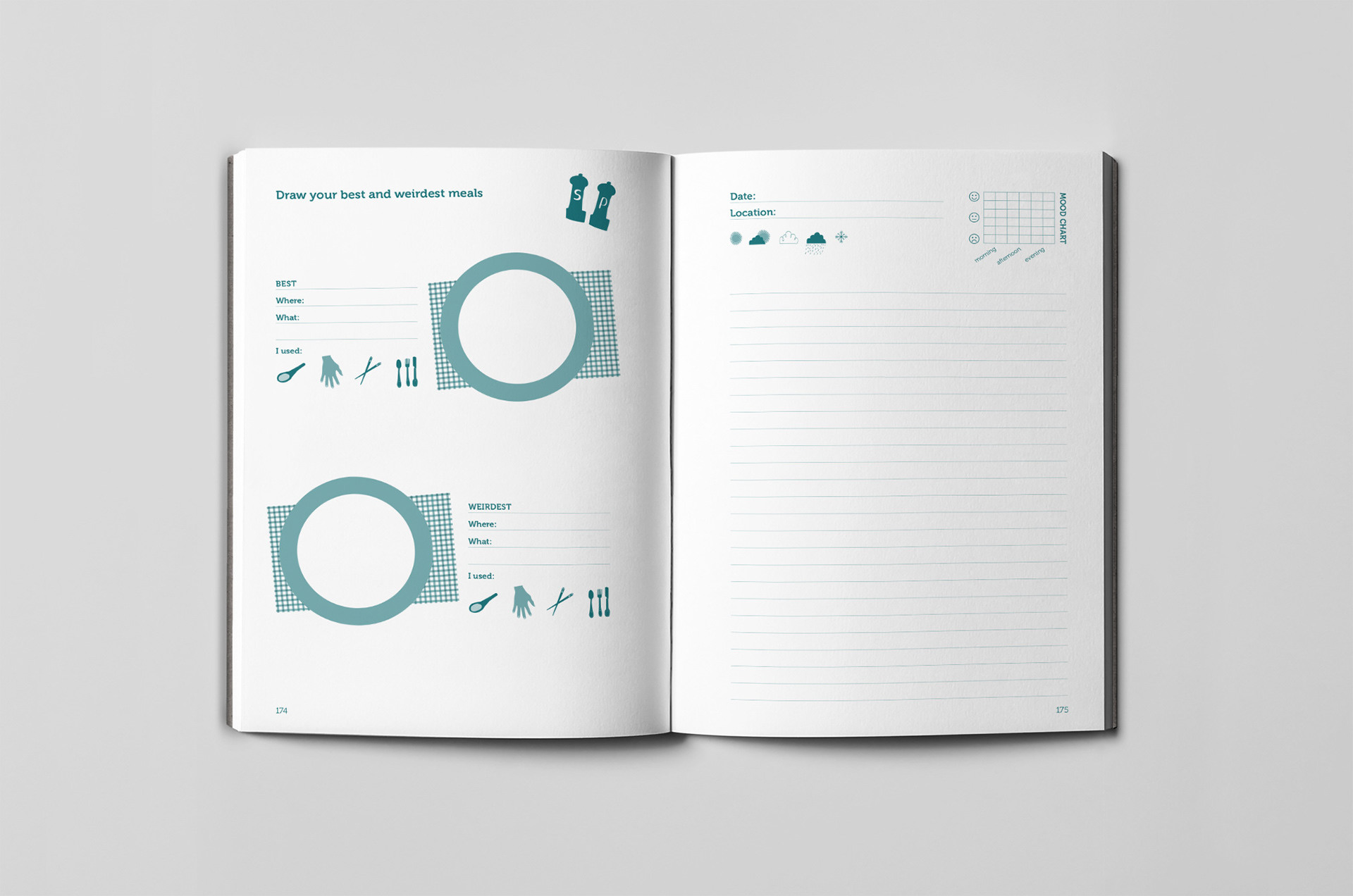
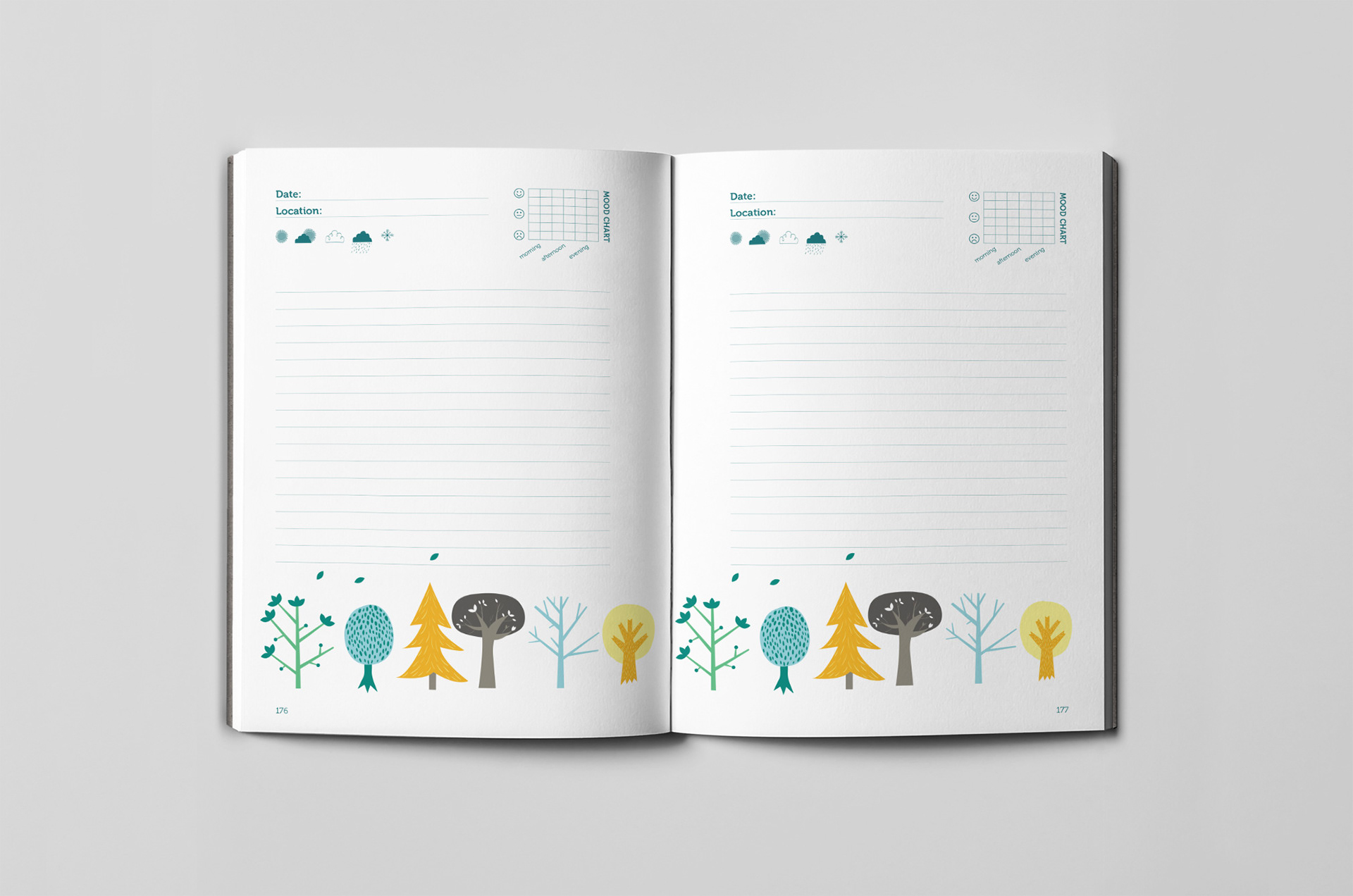
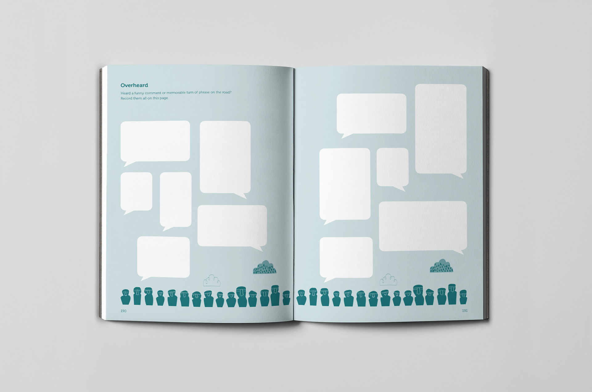
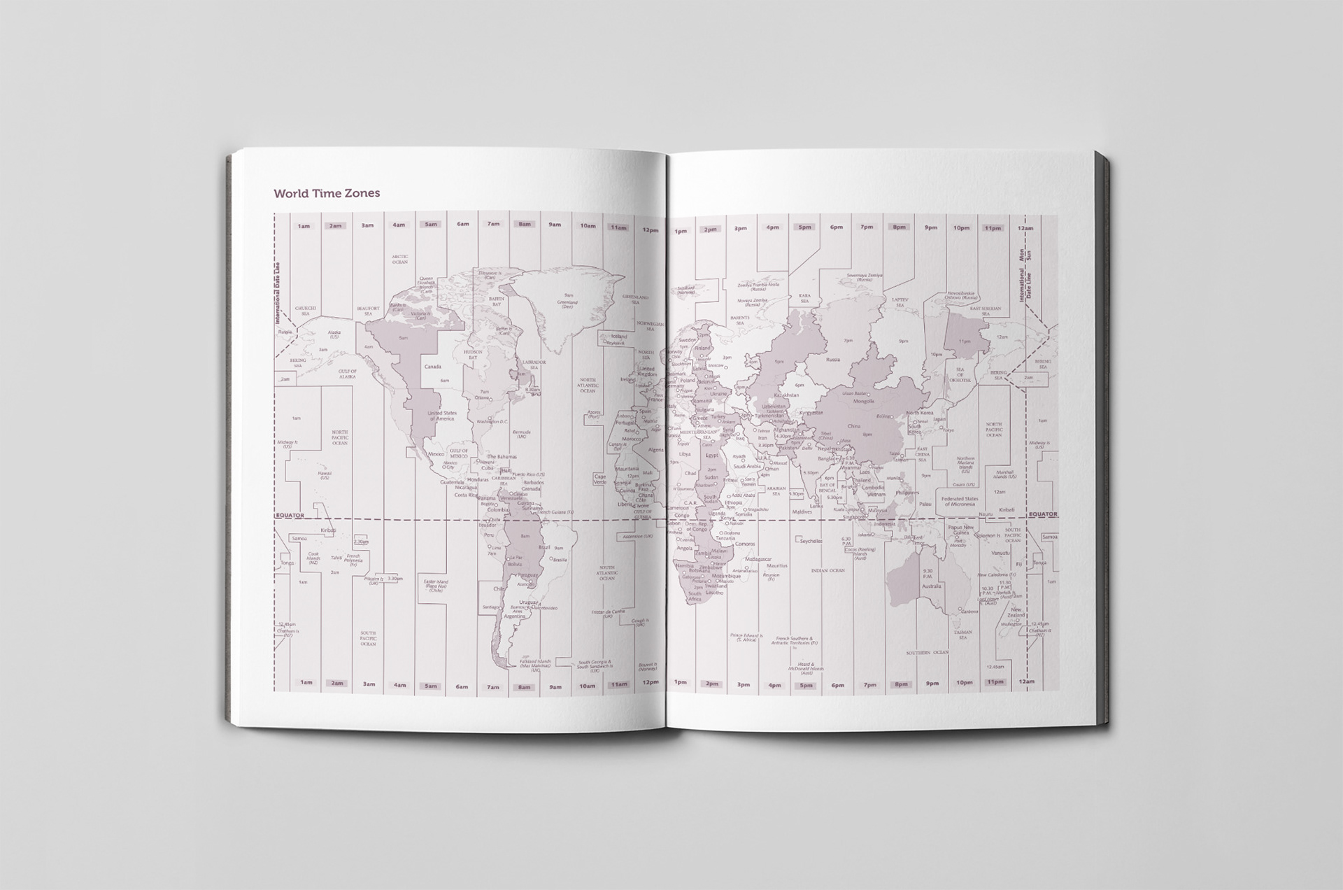
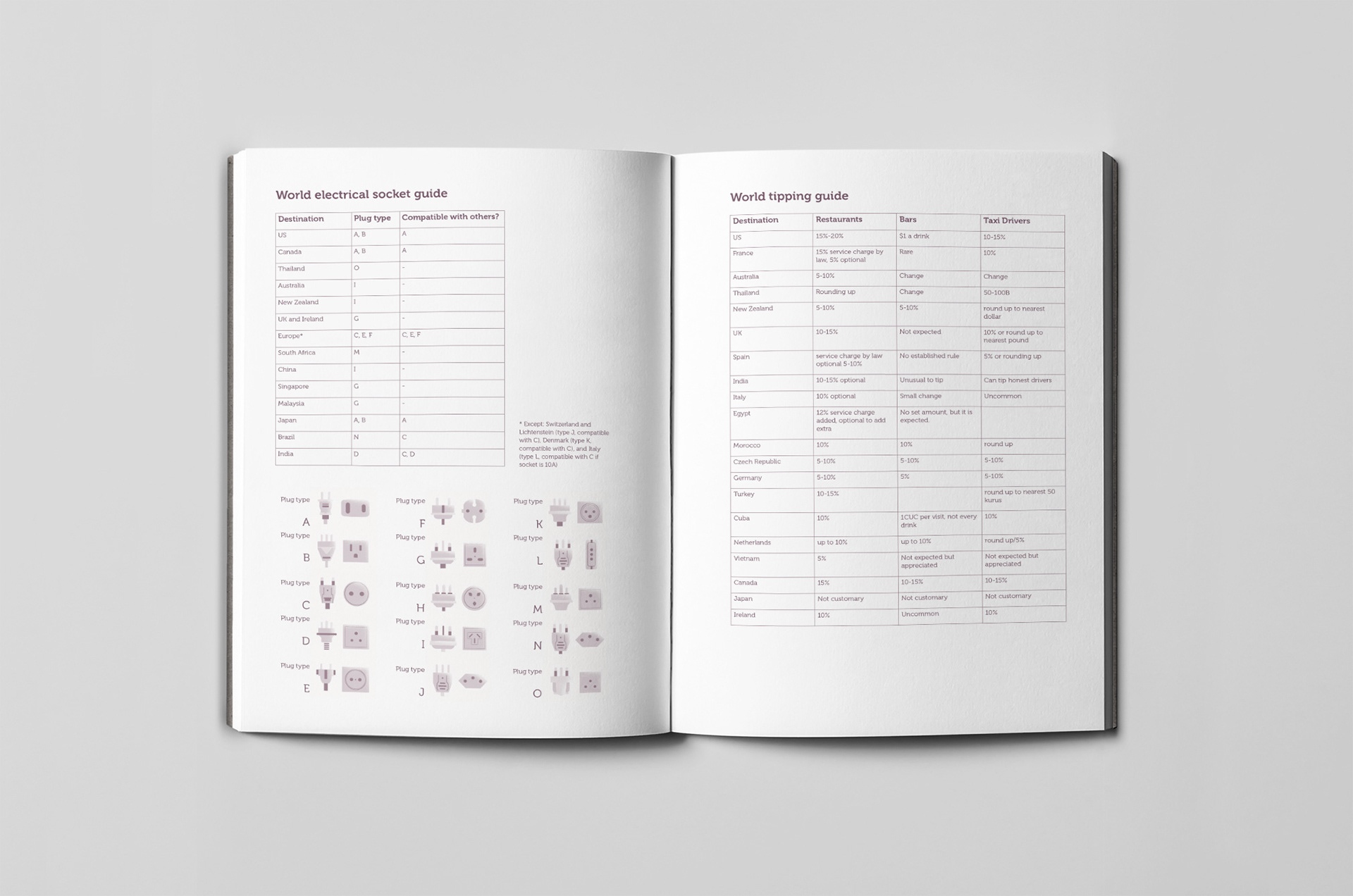
I had some ideas sessions with the Commissioning Editor for the interiors of the travel journal based on our experiences travelling using journals and then she worked her word wizardry on the text. A few months down the line we’d created Lonely Planet’s first comprehensive stationery range; a travel journal, diary planner, three large and three small notebooks.